About the Logo
ARTICLE
River V.C.
8/29/20243 min read


Esocrypt’s logo was originally used as a crew logo, when I used to do small work on larger productions. When you're working in a massive media conglomerate, it can feel as if you're not a part of it at all at times, as other than receiving an email, I mostly worked on independent productions that were hoping to get pilots picked up by said company, being sent and working on set as well as doing editing incase they didn't have a professional editor available to them. During the 2020 Pandemic the need for work-at-home editors went up. So though I missed going to sets and feeling the heartbeat of a movie or show being made, I still got to have a community within the editors and emails we traded.
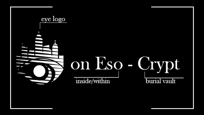
Many of us students in High School and College looking for work to pad their resume or just to make money began to have inside jokes within the files we would leave for each other. These consisted mostly of leaving funny or scary images for each other in spaces that were just blank spaces, easy to be taken out but impossible to miss and in my opinion, harmless fun. Though when a new person went through the footage bins and found random Slenderman cutouts and asked someone in management why. In spite of this, we began using the eye logo. It was created in the moment and therefore had no meaning, which became part of my reasoning to adapt it into the logo for my video commission company, changing its colors around and refining things.
The Eye imagery comes from the feeling of surveillance that being an artist can have in society where art, entertainment, and what companies want from you conflict. One of my biggest shocks in working for said company was their S&P Department. S and P stands for services and practices, normally a division of an entertainment company that's purpose is to maintain a proper brand image throughout all the content that's released. This is nothing new to creators as tales of various S&P Departments are legendary within circles, but the stories of overreach on artists from corporate sides of the studio show a pattern that should be looked at. I wanted to turn this idea on its head not just in this specific context but as an overarching idea, the artists watch what the corporations do just as much as they survey us and what we create. The idea of companies just doing whatever they please and treating their artists and creators as controllable resources is very obvious, especially with the threat of being replaced by a Large Learning Model algorithm. This manifested most recently in the 2023 SAG-AFTRA Strike, and reasonably, the strikes put on by unhappy workers should lead to help in bridging that gap between the people who see artists as the paintbrush, and people who see the artist as a painter.
The city skyline that goes above the eye used to be taller, with more skyscrapers, but it eventually became a simplified rendition of Boston, Massachusetts. The Tallest tower is the prudential center and the surrounding area, this was done because many of the people who formed the original Esocrypt studio met in Boston, and its where the studio was originally based. Esocrypt now functions regionally around the United States Northeast and Canada! The ray pattern was added as a tribute to Mexican television network Televisia.
Purple is not only a favorite color around the studio, but symbolically it's not a very common color for logos, and it has the historical connotations of being expensive and royal and in a society based around capital that is always a nice association to have.


